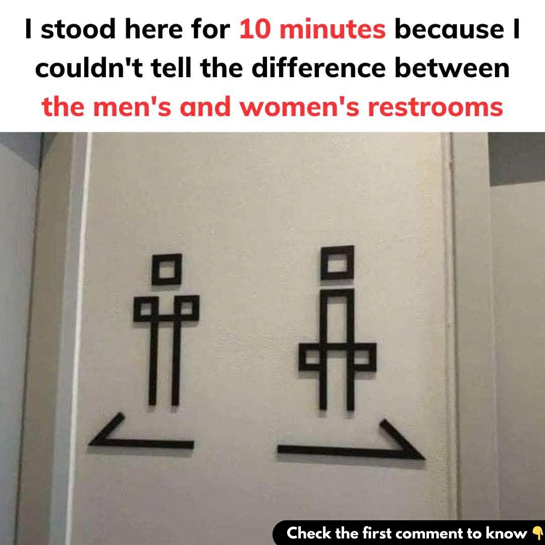
Imagine yourself standing in a public hallway, urgently needing to find a restroom. Yet, you’re frozen in place, staring at two doors, unable to figure out which one to enter. The signs meant to guide you are so ambiguous that you’re left guessing. Sound familiar? This scenario happens more often than you might think, and it’s as frustrating as it is avoidable.

Restroom signage should serve one purpose: to clearly and quickly indicate which facility is which. Yet, many businesses and public spaces complicate this simple task with overly creative, abstract, or culturally specific designs. These designs might aim to reflect a brand’s personality or add a humorous touch, but they often sacrifice functionality for aesthetics. The result? Confused and sometimes embarrassed users, standing in the hallway trying to decode a restroom sign.
Why Restroom Signs Get Complicated
The root of the problem lies in the tension between practicality and creativity. Designers often want restroom signs to be unique, aligning with a business’s brand identity or aesthetic. However, when signs stray too far from convention, confusion inevitably arises. A restroom sign is not the place for abstract art or clever cultural references—people in need of a restroom want clarity, not a puzzle.
When approaching a restroom, our brains rely on quick visual cues to guide us. Traditional signs use universally recognized elements such as stick figures, simple text labels like “Men” or “Women,” or clothing cues such as dresses for women and pants for men. While these conventions might seem outdated to some, they are still effective in providing clear guidance. The problem arises when signs use abstract depictions, ambiguous silhouettes, or unfamiliar cultural symbols. These designs may be clever in theory but can lead to unnecessary confusion in practice.
The Challenge of Inclusivity in Modern Signage
The rise of gender-neutral restrooms has added a new dimension to the discussion around restroom signage. This shift is an essential step toward inclusivity, creating spaces that are welcoming for all genders. Signs for these restrooms often feature phrases like “All-Gender” or symbols such as a toilet or a figure without traditional gender markers. While this approach promotes equality, it can introduce uncertainty for individuals accustomed to traditional signage. A clear, universally understandable design is key to ensuring that these restrooms are easy to navigate for everyone.
Real-Life Examples of Confusing Signs
Some restroom signs have become infamous for their ambiguity. Consider overly artistic designs where one figure might be represented by a triangle and another by a circle. While these shapes could symbolize traditional gender markers, they are far from intuitive. Similarly, humorous signs using animals—like roosters and hens or bucks and does—might be amusing at first glance but can be confusing when you’re in a hurry. Even minimalist designs can be problematic if the differences between the figures are too subtle, such as a slight tilt of a hat or the angle of a head.
Cultural and language barriers further complicate the issue. A symbol or phrase that makes sense in one cultural context may be meaningless—or even misleading—to an international visitor. This lack of universal clarity can lead to awkward or embarrassing situations.
Designing Better Restroom Signs
So, how can restroom signs be improved to avoid these issues? Here are some practical guidelines:
- Use Universally Recognizable Symbols
Stick to traditional stick figures or simple icons that clearly represent men, women, or all genders. These symbols should be immediately identifiable, even in a hurry. - Include Text Labels
Adding straightforward text such as “Men,” “Women,” or “Restroom” ensures clarity for all users, regardless of their familiarity with the symbols. - Embrace Gender-Neutral Options
For all-gender restrooms, a toilet icon or the words “Restroom” can suffice. Avoid overcomplicating the design with unnecessary embellishments. - Test Your Signage
Before implementing new restroom signs, test them with a diverse group of people. If even one person hesitates or misinterprets the sign, it’s worth revisiting the design. - Avoid Stereotypes
Outdated markers like dresses for women and ties for men can feel exclusionary. Opt for designs that reflect the diversity of gender expression today.
The Broader Impact of Clear Signage
While confusion over restroom signs may seem like a minor inconvenience, it highlights broader issues of inclusivity and accessibility. For individuals who are non-binary or transgender, navigating public restrooms can be a stressful experience. Clear, inclusive signage sends a message of respect and welcome, creating spaces where everyone feels comfortable.
Conclusion: A Small Step Toward Greater Inclusivity
Restroom signs may seem like a small detail, but their impact is significant. They reflect how businesses and institutions consider the needs of their patrons. By prioritizing clarity and inclusivity, we can avoid frustrating and awkward situations while fostering a sense of belonging for all.
The next time you encounter a confusing restroom sign, take a moment to consider how something so seemingly simple can spark such a complex conversation. As we strive for a more inclusive society, let’s ensure that our signs point the way forward—clearly, effectively, and respectfully. Everyone deserves the dignity of finding a restroom without confusion or stress.


