Logos are more than just visual symbols for brands—they are meticulously designed to tell stories, evoke emotions, and sometimes hide messages. Many of the logos we see daily contain layers of meaning and clever details that often go unnoticed. These hidden elements not only make the logos memorable but also create deeper connections with the brands they represent. Let’s uncover the fascinating secrets behind nine of the world’s most iconic logos.

1. The Story Behind Uncle Ben’s Logo
Uncle Ben’s, a popular brand known for parboiled rice and other foods, debuted in the U.S. market in 1943. Since 1946, its logo has featured the face of an elderly Black man wearing a bow tie. According to one story, this image was based on Frank Brown, a maître d’hôtel from Chicago.
Frank’s warm demeanor and professionalism caught the attention of the company’s founders during a dinner at a Chicago hotel. They paid him to use his likeness as the face of the brand, creating an enduring image that has represented the company for decades.

2. Tesla’s Logo: A Tribute to Innovation
Tesla Motors, founded in 2004 by engineers Martin Eberhard and Marc Tarpenning, was named after Nikola Tesla, the Serbian-American inventor renowned for his contributions to electricity and magnetism.
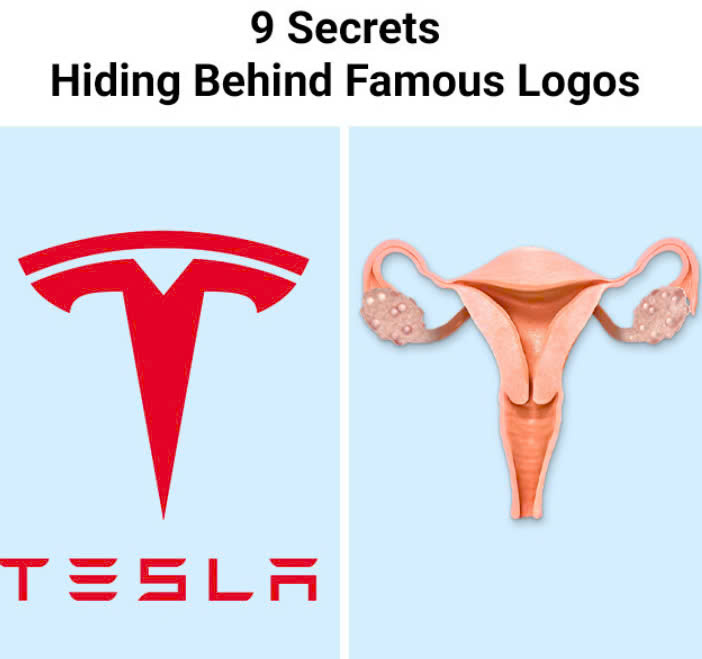
The Tesla logo has sparked numerous theories on social media. Some say it resembles a cat’s nose, while others jokingly suggest it represents the female reproductive system. Even Elon Musk once joked about these interpretations.
However, the truth is simpler: the logo represents a cross-section of an electric motor designed by Nikola Tesla in 1883. This nod to Tesla’s groundbreaking work aligns perfectly with the company’s mission to revolutionize transportation through electric vehicles.
3. Hershey’s Kiss Hidden in Plain Sight
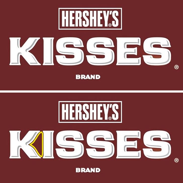
Hershey’s Kisses, one of America’s favorite candies, hides a clever design detail in its logo. Look closely between the “K” and “I,” and you’ll see the shape of a Hershey’s Kiss candy. This playful addition reinforces the brand’s identity and delights those who notice it.

4. Quiksilver’s Oceanic Inspiration
The logo of Quiksilver, a popular surfwear brand, was inspired by the iconic Japanese woodblock print The Great Wave off Kanagawa by Katsushika Hokusai. Designed in 1973 by the brand’s founders, Alan Green and John Law, the logo captures the raw power and beauty of the ocean, reflecting the brand’s deep connection to surf culture.
5. Versace’s Hypnotic Medusa
Gianni Versace, the legendary Italian fashion designer, chose Medusa as the emblem for his brand in 1987. Inspired by the Medusa Rondanini sculpture, the logo portrays Medusa as a figure of mesmerizing beauty, transforming her from a monstrous creature into an icon of allure.

Gianni believed that Medusa’s power to captivate those who gazed upon her reflected the essence of his fashion designs. He wanted his clothing to make wearers feel irresistible and unforgettable, just like Medusa’s mythical charm.
6. Disney’s Tinker Bell, Not a Falling Star
The Walt Disney Pictures logo, which features a fairytale castle, is one of the most recognizable images in entertainment. The castle was inspired by Neuschwanstein Castle in Bavaria, a nod to the magic of Disney’s classic stories like Cinderella and Sleeping Beauty.
Many people assume that the arc of light over the castle is a falling star, but it’s actually Tinker Bell from Peter Pan. This whimsical touch ties the logo to Disney’s legacy of fantasy and storytelling.
7. The Infinite Cow in The Laughing Cow Logo
The Laughing Cow cheese logo features a cheerful red cow wearing earrings. What makes it unique is the Droste effect: each earring contains an image of the same cow wearing earrings, creating an infinite loop. This clever design detail adds a layer of mystery and memorability to the brand.
8. NASA’s “Meatball” Logo
NASA’s iconic logo, often referred to as “the meatball,” was created in 1959 by James Modarelli. Its design is packed with symbolism. The round blue shape represents Earth, while the stars signify space exploration. The red wing symbolizes aeronautics, and the curved line represents a spacecraft’s trajectory.
This timeless logo encapsulates NASA’s mission to explore the unknown, blending aeronautics and space in one cohesive design.
9. Lukoil’s Name Encodes Russian Oil Cities
The name of the Russian oil company Lukoil is a combination of geography and industry. The “LUK” in Lukoil stands for three oil-producing cities: Langepas, Uray, and Kogalym. By adding “oil,” the brand ties its name directly to its business, creating a meaningful and strategic name.
Logos as Works of Art
These examples demonstrate that logos are more than simple designs—they are intricate works of art filled with stories, hidden meanings, and thoughtful symbolism. Whether it’s Tesla’s tribute to Nikola Tesla, Disney’s magical nod to Tinker Bell, or the infinite loop in The Laughing Cow’s earrings, these logos connect with their audiences in subtle yet powerful ways.
The next time you see a logo, take a closer look. You might uncover a story or a secret that makes you appreciate it even more. Logos are not just about branding; they’re about storytelling, creativity, and connection.
Have you noticed any hidden secrets in logos? Share your thoughts and discoveries!


